
Chef’d
A B2C and B2B ecommerce website for ordering individual and subscription-based meal prep packages.
Product detail page redesign
OVERVIEW
Problem
Analytics tracked high drop-offs and low conversion from Product Detail Pages (PDPs).
Goal
Redesign the information architecture of PDP content to enhance user experience, drive engagement, and increase conversion—guided by insights from user-generated content and interaction analytics.
My Role
Digital Art Director and UI Designer
A/B testing, information architecture, UX Research
tools
Sketch, Shopify, Photoshop, Survey Monkey, Google Analytics, Optimizely, Jira, whiteboard, sticky notes
Background
Chef’d offered both subscription-based and à la carte meal plans, bringing chef-inspired global cuisine to cooking enthusiasts at accessible prices.
As the Digital Art Director and principal UI designer, I was brought on to address low conversion rates and high drop-off from product detail pages (PDPs), as revealed by analytics data. I collaborated closely with stakeholders across marketing and engineering to run a series of A/B tests and encouraged users to share feedback through incentivized surveys focused on their ordering experience.
In this case study, I’ve broken down the PDP section by section to clearly outline the information architecture, presenting each with a corresponding problem-solution analysis.
Observations
Problem
CTAs not above the fold
While the product imagery is visually striking, its dominant placement above the fold results in an imbalanced information hierarchy. User feedback indicated confusion due to the absence of a visible call-to-action and product description, which made it unclear how to proceed
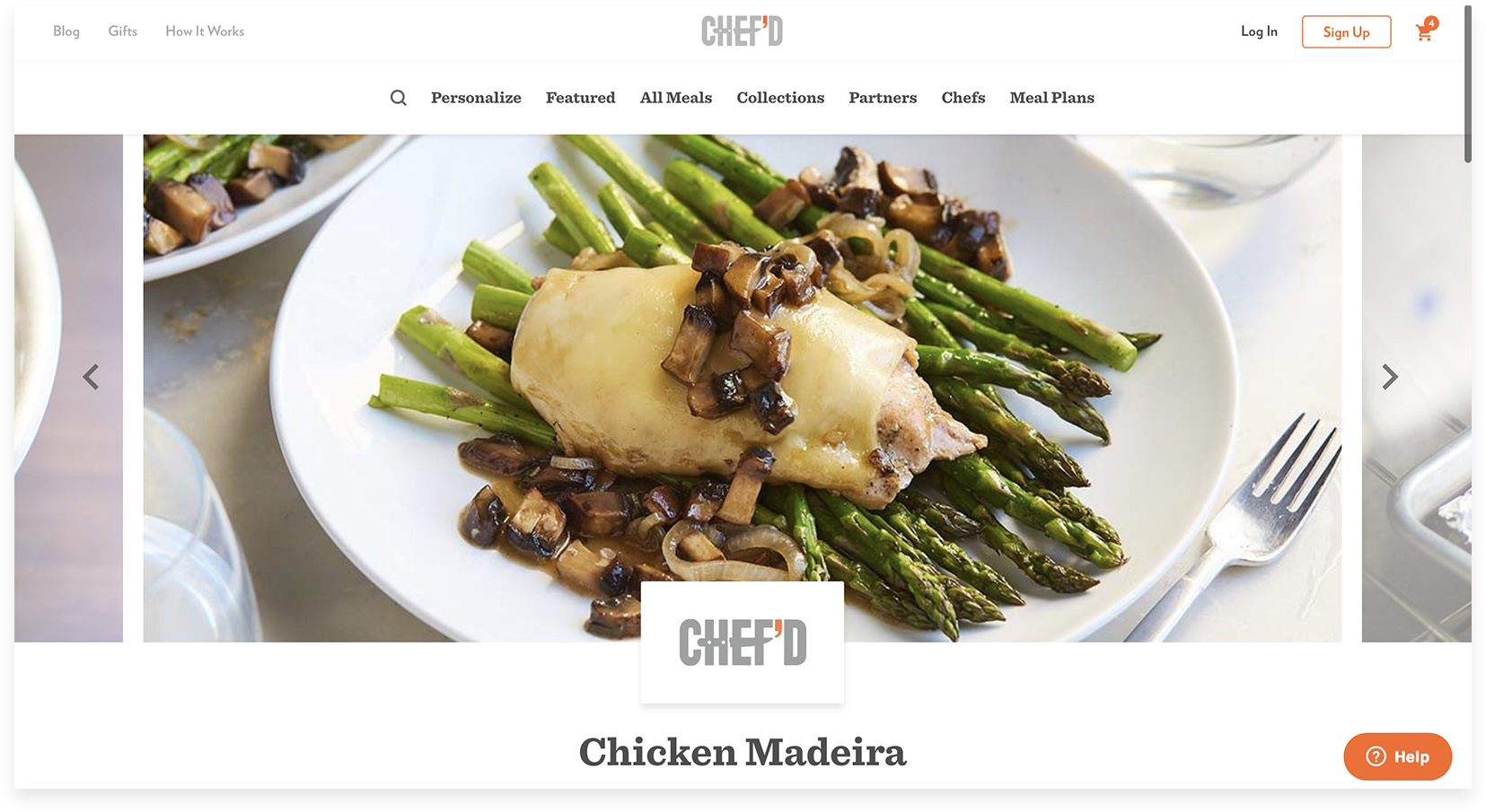
Above the fold PDP before redesign
Solution
Give greater priority to CTAs
I redesigned the PDP to provide a more familiar and intuitive image thumbnail viewing experience. Key actions—such as the primary CTAs and product description—were repositioned above the fold to improve visibility and support a clearer, more action-oriented user journey.
User research showed that most customers weren’t interested in adjusting order quantities on the PDP, making the feature unnecessary at this stage of the flow. To reduce visual clutter, quantity selection was moved to the cart, where users expect more detailed order management.
A/B testing confirmed that displaying two primary CTAs performed well with our audience. However, results also emphasized the importance of using clear, action-driven language to communicate the purpose of each button more effectively.
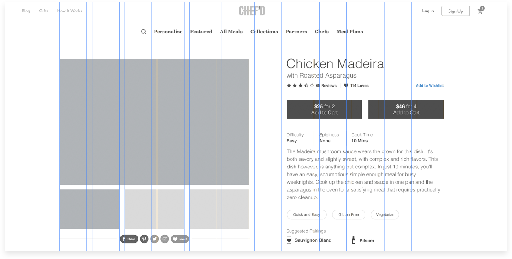
Wireframe of above the fold PDP after redesign
Problem
Unnecessary actions required by user
User feedback indicated that accessing additional product information required too many clicks where one participant described the experience as having to “hunt around the page.” This unnecessary effort contributed to user fatigue and ultimately led to increased drop-off rates.

Access to information within Allergens and From Your Kitchen tabs requires unnecessary click and swap of displayed data
Solution
Display ingredients without requiring a click
Based on UX research, the Ingredients along with information listed within the From Your Kitchen and Allergens were equally sought-after content. To reduce friction, we updated the interface to display information regarding all three categories without requiring the user to click to discover additional information.
Additionally, we introduced a “Similar Meals” section as a strategic opportunity to retain users who may not be interested in the primary offering. By showcasing related options, we aimed to keep users engaged and within the purchase funnel.
We decided against implementing a quick view feature. Recent findings indicated that it neither improved nor hindered conversion, yet placed an unnecessary burden on technical resources.

Wireframe showcasing all relevant information without requiring extra user interaction
Problem
Q&A CTA competes with primary action CTAs
A prominently placed “Ask a Question” CTA near the bottom of the page was unintentionally drawing attention away from the sticky primary action buttons in the header. This imbalance in visual hierarchy risked diverting users from the intended conversion path.
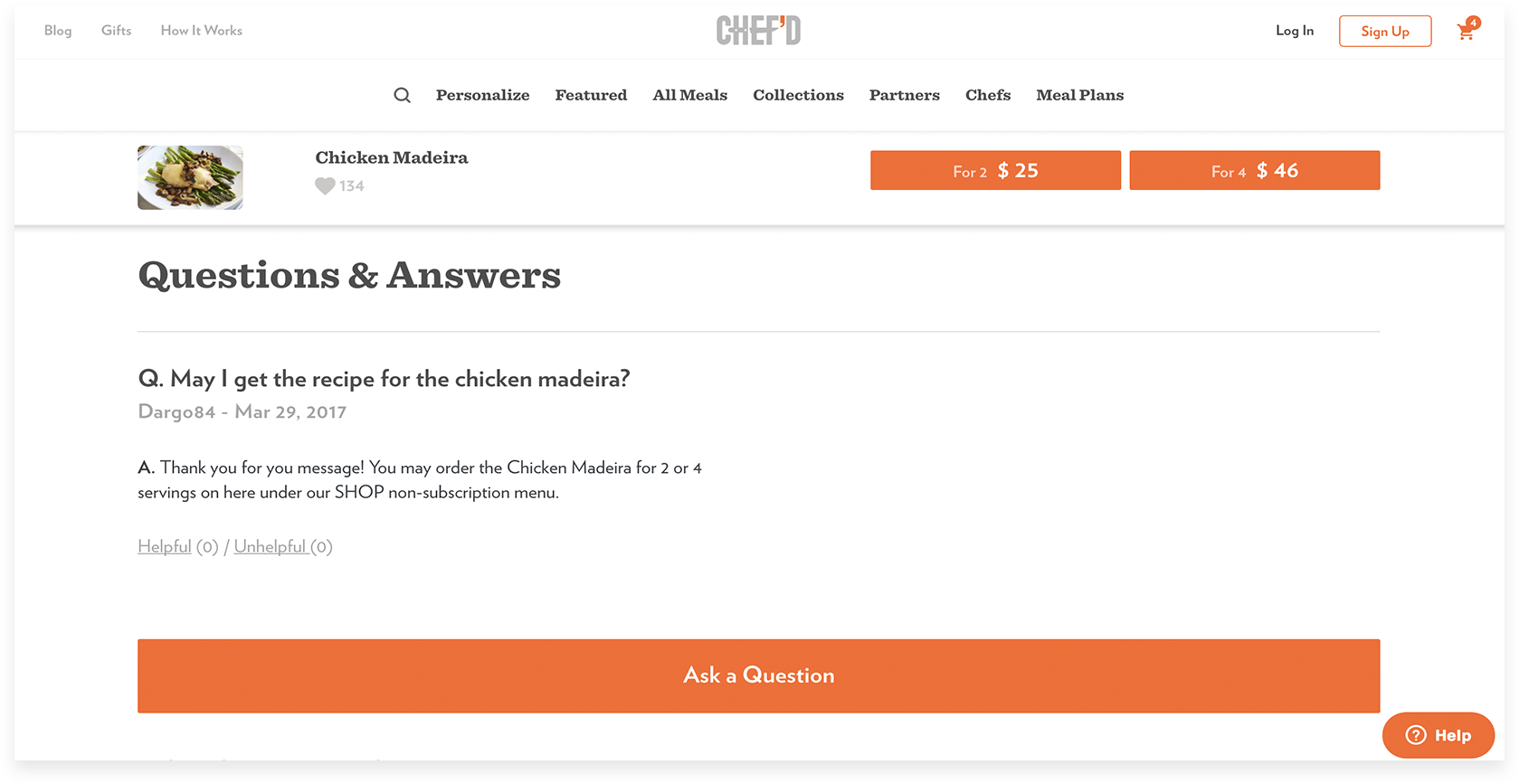
Questionable priority of Ask a Question feature competing against primary CTAs
Solution
Reduce visual prominence of “Ask a Question” CTA
By adjusting the visual styling and reducing the prominence of the “Ask a Question” button, we reestablished visual priority for the primary action CTA.
Additionally, user feedback indicated a desire for a more intuitive way to mark answers as helpful or not. The current gray styling gives these options an inactive appearance. Updating them to a more engaging link color with a hover state helped signal interactivity and encourage engagement.
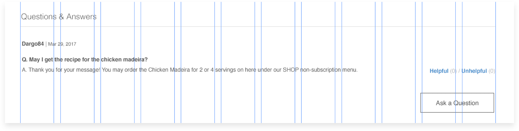
Wireframe of modified Ask a Question feature with a less prominent visual styling and placement
Problem
User is required to log in to post a review
Requiring users to log in before posting a review creates friction and discourages contributions to User Generated Content (UGC), as many users perceive retrieving login credentials as a hassle. While it's important to tag logged-in users who have completed a purchase as “Verified,” we should still allow non-verified users to share reviews, ensuring their voices are heard while clearly distinguishing between verified and unverified contributions.

Unnecessary yielding of valuable UGC
Solution
Give users not logged-in ability to submit a review
In addition to enabling non-logged-in users to submit reviews, we also offered the option to simply recommend a product. This low-effort interaction allowed users to express their opinion without the commitment of writing a full review—encouraging broader participation with just a quick click.
I styled the “Recommend” button with equal prominence to the existing “Ask a Question” button, using a consistent secondary button treatment. Likewise, the “Helpful/Not Helpful” links were visually aligned with the text links used in the Q&A section to maintain a cohesive and intuitive user experience.

Wireframe showcasing open access to submitting review with the added benefit of marking a review as verified
Successful redesign resulting in increased conversion
Following several rounds of iterative testing, refinement, and final polish, the launch of the redesigned experience led to a 60% increase in conversion within the first 30 days post-deployment compared to the prior 30-day period. During that same timeframe, user-generated content (UGC) activity nearly doubled—demonstrating stronger user engagement and overall satisfaction.


More projects

Mars Veterinary Health Case Study
Surface key search details at a glance and enable quick actions directly from the search screen.

Nordstrom Rack Case Study
Design of original mobile app, leveraging usability testing, heuristic design, and gap analysis